The weather was lousy today, so I couldn’t mow the grass. A shame, since I wanted to do something useful. I decided to get artsy while staying inside, so I entered the MonoGame logo contest.
Mono + Game = MonoGame
For the MonoGame logo I wanted to use good visual associations so that the picture adequately describes the nature of the framework. Of course everyone knows the white monkey, which is synonymous with the Mono project. But when I think of the word “game”, a single image comes to me immediately. A single image which brings back a lot of memories from the good ol’ days. The long nights spent playing… Pac-Man! (oh, yeah baby!) This is where I drew my inspiration from.
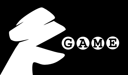
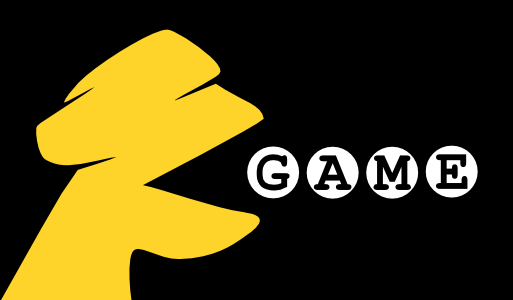
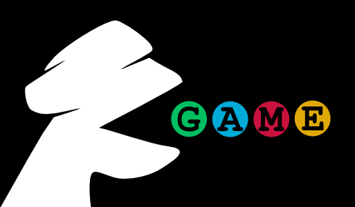
All versions of the logo feature a slightly rotated Mono monkey with its mouth wide open in the tribute to the well-known arcade character. In front of the monkey are four circles, each one containing a letter from the word “game” (Monospace typeface). The circles are meant to represent the food balls from Pac-Man. Not the small, normal ones. Oh no. These are the “power pellets” which give Pac-Man super powers!
Version 1 – Black and White
I am a fan of minimalism, so the first logo is black and white. It should nicely match the original Mono project logo.

Version 2 – Yellow Pac-Man Monkey
This version of the logo features the yellow color, which brings it closer to the popular arcade games character.

Version 3 – White Monkey, Color Pellets (my favorite)
This version of the logo is meant to express the affiliation of the MonoGame project as well as to underline the cross-platform characteristics of its framework. The Monkey is white to make strong association with the Mono project, while the pellets feature colors which are prominent in logos of popular operating systems:
- Green – Android
- Blue – Mac/iOS
- Red – FreeBSD
- Gold – Linux (Tux’s beak)
- All colors – Windows

There are lots of other really awesome contest entries, so please keep your fingers crossed and wish me luck 🙂
